Saturday, 22 January 2011

Character Design from life....


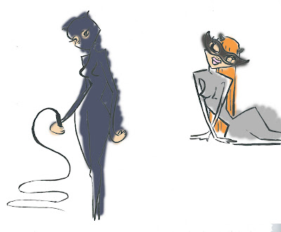
...well photos of life. I drew people I found in photographs really quickly and coloured them really quickly to try and get loads of characters down in short amount of time.

More Ivy


Still getting my head around colouring in photoshop and using textures.

Dolls


I've been playing with cut outs and fabric samples to create textures to give a better idea of what the puppets could look like in actuality. I pushed this a lot and made some of the characters into little rag-doll-looking puppets, by starting with very basic, classic 'Raggedy Annie' shape and building textures on top on photoshop and adding colour using layer styles and setting the colour overlay to multiply and soft light. I really like the results stylistically but I don't think Ill go with them as final designs because its not something that suits every character. For example, Ivy and Harley worked out a lot more successfully that catwoman, who seems to suit more slender and elongated shapes.

Thursday, 20 January 2011

First Ivy Doodles


Changed over to art strand in uni, no more animating just a load of character design :) The brief is to redesign existing, established characters. I've chosen to draw batman villains and redesign them as stop motion puppets. We had the option of changing the target audience but I decided to keep that as it was and concentrate on creating characters for a difrent medium. I started drawing Ivy first because she's my favourite. These show her in the two ways she is usually portrayed, one when she is more human-esq and the other when she is more plant like.

Me Doodle


Utterly stressed by minor project and feeling severely less than optimistic, took a break and doodled a little me. Just made a bookmark with her on too, may scan it tomorrow in between inbetweening. May get around to colouring this one too. We'll see.......


ps. The thought bubble, been thinking about peppermint chews all day

Genies Bottle

Final Colour Key
Testing combining complimentary colours
Tonal
Tone and Colour Test


These were the two finals. One with the character in situ to give an idea of how she would act in the space. My favourite part of the scene is the genie bottle, this is how she enters the room, as a puff of smoke.
Just had the grade back for this it was ok, i suppose. Umm, I liked making the colour keys, I like the Pixar approach to design, starting with basic shapes and colours using bits of paper. It was based around a character I designed in first year that I still enjoy doodling. I want to go back into it and add more patterns and textures so it has even more of a cut out collage look.